Yogurtland
Website Redesign & Video
With an innovative self-serve concept that has swept the nation, Yogurtland looked to JLOOP to modernize their web presence and revitalize their focus on flavors in a ground-up website overhaul.

Background
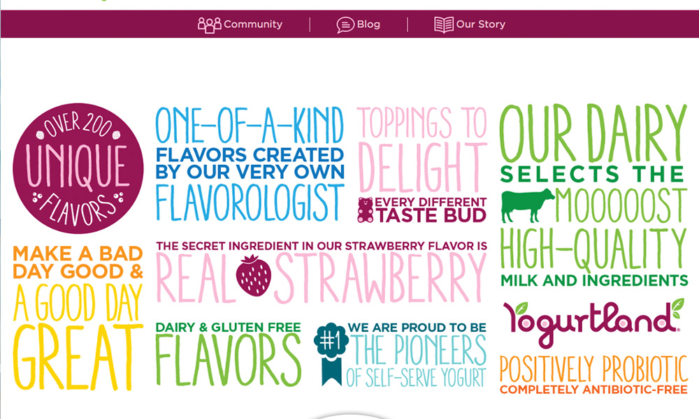
As a brand, Yogurtland stands apart from their competition due to their focus on real quality ingredients, and unique flavors.
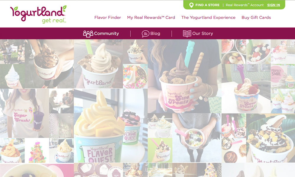
We saw huge opportunity to refresh the energy and voice of the brand and better align with these goals.
There was also an exciting opportunity to maximize the mobile experience for their loyalty program and store and flavor search functions.
What We Achieved
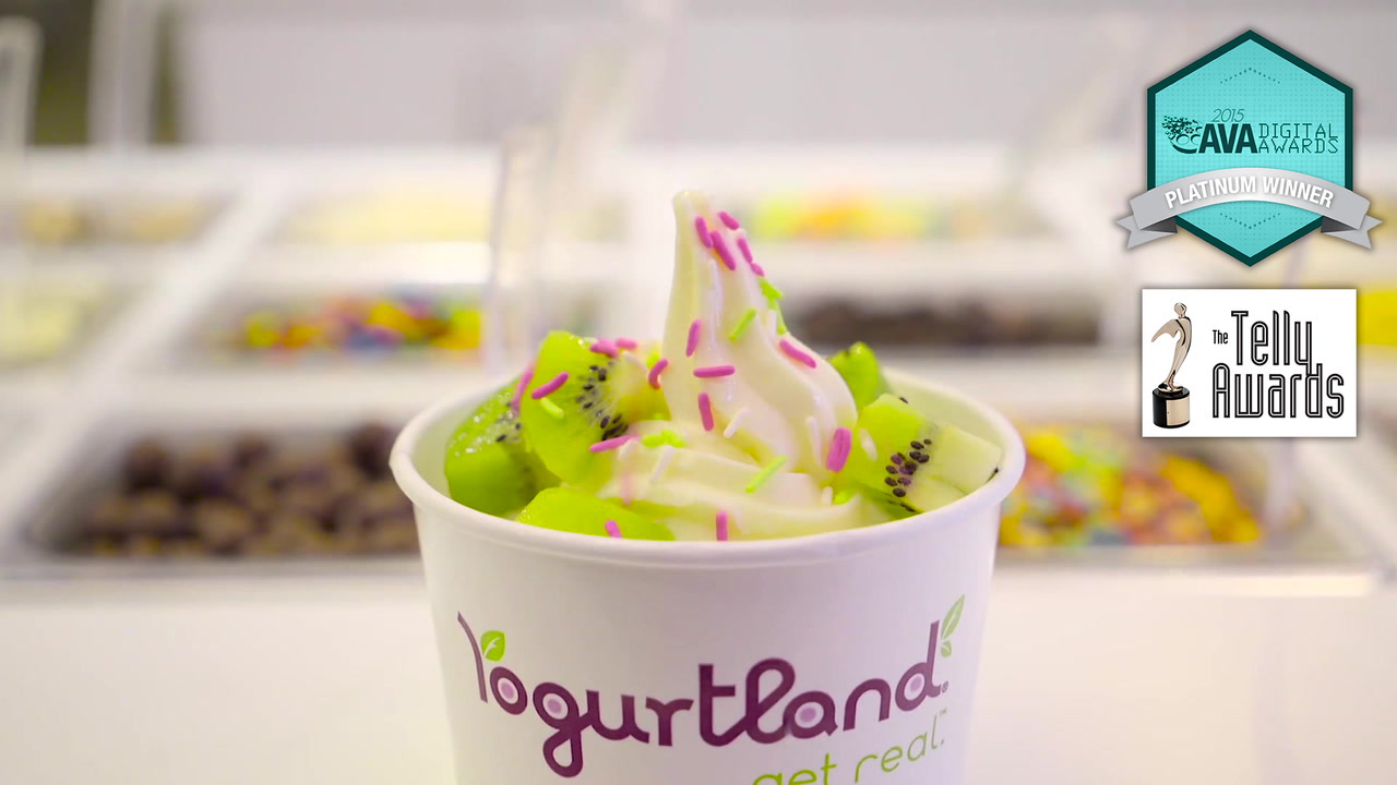
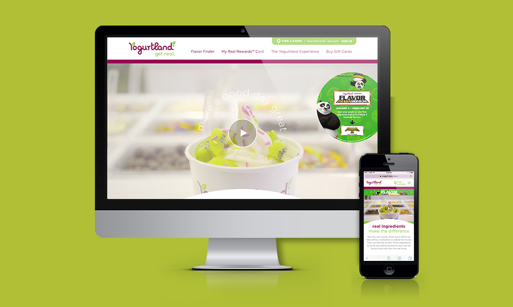
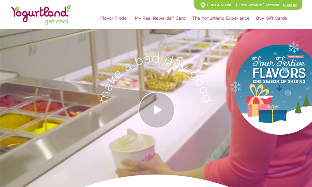
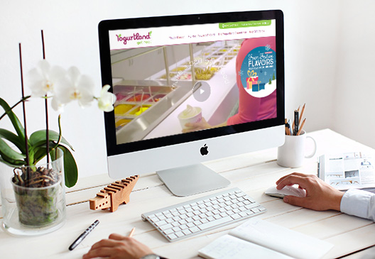
With our sights set on the customer experience, JLOOP developed an immersive video experience for the home page that engages the website visitor in the energy and fun of visiting a Yogurtland store. A video background on the home page serves as an invitation to launch the award-winning video (embedded below).
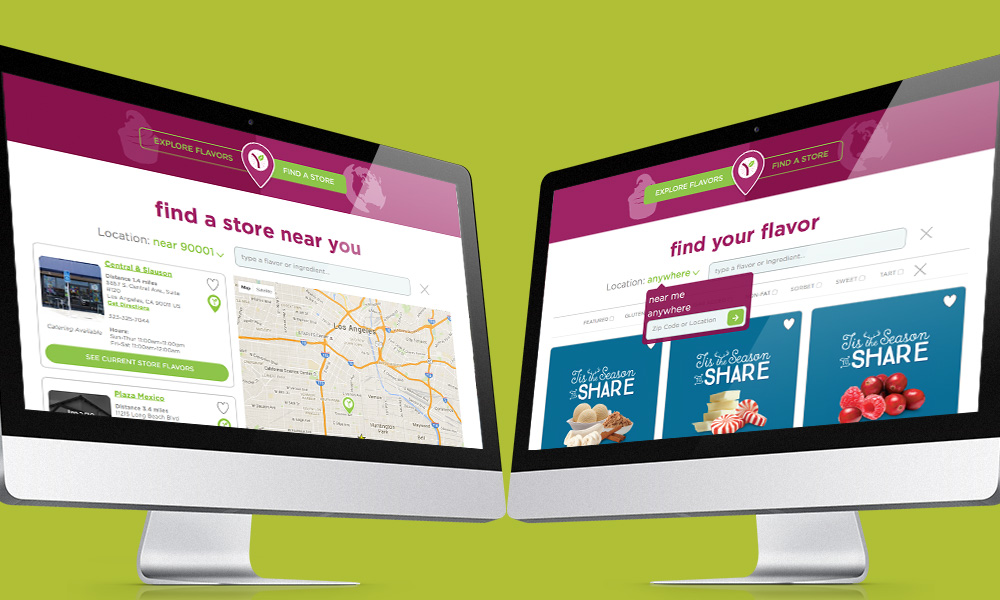
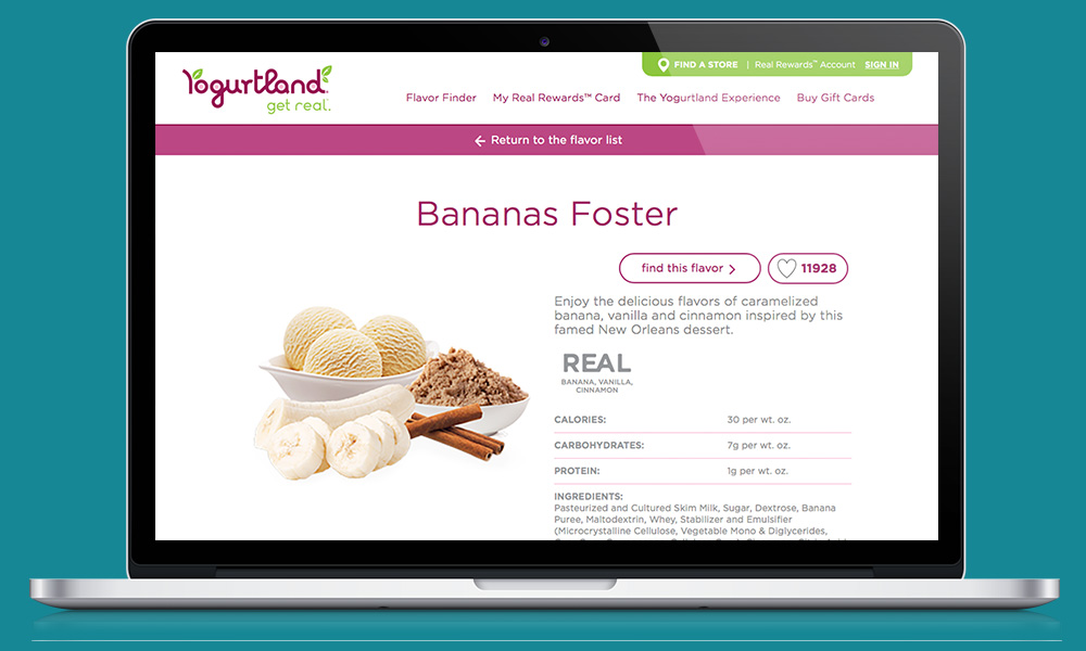
To highlight Yogurtland's focus on flavor, JLOOP dreamt up a unique Flavor Finder feature to enable customers to search by flavors and ingredients while simultaneously revealing nearby locations to indulge.
Of course the mobile customer is key to the frozen yogurt business, so it was crucial that the new website be mobile friendly. JLOOP built Yogurtland's new website with responsive techniques and an optimized experience for desktop, tablet and phone.
JLOOP revisited the complete user experience for the Real Rewards loyalty program with an eye on simplification of messaging and focus on efficient access to critical user needs. All the while, we listened and responded to internal needs and greatly reduced the business cycles needed to handle multiple tedious internal processes.

