ACE Fitness
Website Redesign
Getting a website into the best shape of its life.

A Fresh Approach
ACE is the leading health and fitness certification organization with a mission dedicated to getting people moving. Unfortunately, their website experience had passed its prime—both navigation and messaging needed a fresh approach to better guide the user through their journey towards certification.

Comprehensive UX Strategy
Our team worked with ACE stakeholders at all levels in one of our most immersive strategy development phases to date. It was a given that the new site needed to present information in a clear and compelling way, but we also discovered that individually-tailored experiences for ACE’s unique audiences would be crucial to the design.
User-Centered Navigation
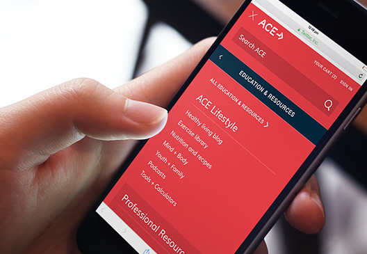
We created a site that elegantly combines multiple pathways with site-wide navigation that organizes huge amounts of information in an inviting and intuitive way. We dropped breadcrumbs throughout the site that keep users on track and designed a unique side navigation that can be managed and changed contextually based on cookies.


Reducing Friction
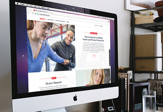
Through strategy and collaboration, we were able to weave a seamless experience and a cohesive story throughout the site. The Certification 101 page guides users through exactly what’s needed depending on their specialty, and thoughtfully-placed quick help modules help point undecided users toward their desired path.
What We Achieved
This site was a great example of how JLOOP’s added muscle can help push a project over the top. We collaborated throughout on strategy and were able to hand off our front end development to ACE to handle content management. We pride ourselves in our excellent working relationships with internal client teams, and the success of this collaborative effort is poised to continue in future projects with ACE.
